6. Making It Look Like Yours
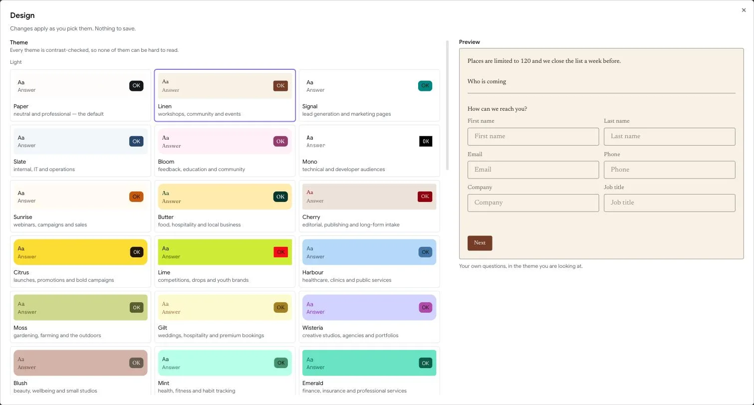
Twenty-Seven Themes
Design in the builder opens a gallery of twenty-seven themes, with a live preview of your own questions beside it. The preview is not a stock example — it is the first three questions of the form you are building, in the theme you are looking at.
The gallery is split into Light and Dark, because twenty-seven of anything is a list rather than a choice. Each card says who the theme is for: Paper is neutral and professional — the default; Midnight is for product launches and developer tools; Gilt is for weddings, hospitality and premium bookings. Pick by the sentence rather than by the swatch and you will usually be right first time.
Above the gallery is the promise: Every theme is contrast-checked, so none of them can be hard to read.
That is not a slogan. Every theme's colours are measured against the accessibility standard before it ships — text against background, muted text against background, button text against button, error text, borders and the focus ring — and a theme that fails does not go out. It is a test that runs on every change, not a review somebody does when they remember to.
Try Anything, Then Save
The dialog says so in its own description: Try anything here. Your form changes when you save. Everything you pick shows up straight away, in the preview beside the controls and on the canvas behind the dialog, but nothing reaches your live form until you press Save changes at the bottom.
The bar along the bottom tells you where you stand: You have unsaved changes while you are trying things, All changes saved once they have landed. Discard puts everything back to what was saved. If you try to close the dialog with something unsaved, it asks you to save or discard first rather than throwing your work away.
This is the same on the Design tab of the Settings screen, so the two places behave alike.
Why it waits: a colour picker is a drag, and one drag is dozens of colours. If each one went live, everyone filling in your form while you experimented would watch it change under them.
Your Own Colours
Under the gallery is a group headed Make it yours, split into labelled sections. The first is Colours, and every colour in it can be anything you like:
- Type a hex code such as
#7C3AEDinto the box. Your code is kept exactly as you typed it, so your brand colour stays your brand colour. - Or click the swatch to open a picker: drag in the square for lightness and depth, drag the rail for the hue, or choose one of the suggested colours under it.
- Or, in Chrome and Edge, use the dropper to pick a colour from anywhere on your screen, such as your own website.
Background sits behind the whole form. Questions and answers is the colour of the words. Buttons is the colour of the submit and next buttons; their label colour is chosen for you so it stays readable. Buttons, under the pointer is the colour a button turns when someone points at it. Leave it alone and FlyForms picks a shade of your button colour for you, checked so its label is still readable.
Nothing is forbidden. If a colour you choose would be hard to read against your background, the panel says so under the colour, and you can keep it anyway. The suggested colours in each picker are the ones already known to read well on your background, so they are a safe place to start.
Each colour shows Use the theme's once you have changed it, which puts that one back. Reset to the theme at the top of the group puts all of them back at once.
Text And Spacing
Alignment is Start or Centre. Start means the form reads from the side the language starts on; Centre puts it down the middle.
Text size is Small, Regular or Large. Every form is born at Large, and that is deliberate: a form is read once, on somebody else's phone, by somebody doing you a favour.
Spacing is Tight, Regular or Roomy: the gap between one question and the next, down the page.
Space between fields on one line is the gap between questions placed side by side, such as First name and Last name. It starts at 16 pixels.
Space before a button on the same line is the gap between a field and a button placed next to it. Zero makes them touch.
Corners
Corners offers Sharp, Soft and Round as quick choices, and Corner size lets you set any size from square to 32 pixels for every field and button at once. Half a field's height, 22, makes a full pill.
For shapes one size cannot make, Field corners, one by one and Button corners, one by one take a number for each corner. The corners are named Top, start, Top, end, Bottom, end and Bottom, start, following the reading direction, so a form in Arabic mirrors them for you. Use the corner size puts a control back on the single size.
Joining A Field To Its Button
Join a field to its button draws a field and the button beside it as one control, like the subscribe box at the bottom of many websites: the two touch, the field is rounded only on its outer side and the button only on its outer side.
To build one, place the button beside your question (see Pages and endings), set Corner size to 22 for a pill, and turn the switch on. Corners you have set one by one still win, so you can fine tune the shape. On a phone, where the button drops under the field, the two separate again and both get rounded corners, because there is nothing for them to join to.
Your Own CSS
Custom CSS takes a stylesheet of your own for this form. It applies wherever the form appears: its own page, an embed, and an embed that blends into your page.
Open What you can style under the box for the parts you can target, each with an Add button that drops a starting rule in for you:
| Selector | What it styles |
|---|---|
.flyforms |
The whole form. Set the custom properties below here. |
.flyforms-answer input |
Text, email, number and date fields. |
.flyforms-answer textarea |
Long answers. |
[data-question-label] |
The words above each question. |
.flyforms-choice |
One option in a choice question. |
button[type='submit'] |
The submit and next buttons. |
.flyforms-problem |
The message under a field that needs fixing. |
The simplest way to restyle a form is to change a custom property on .flyforms,
because every rule reads them: --form-bg, --form-text, --form-primary,
--form-primary-hover, --form-radius, --form-gap and --form-button-gap.
.flyforms {
  --form-primary: #2d6cdf;
  --form-radius: 22px;
}

.flyforms-answer input {
  height: 72px;
  background: #2b2b2b;
  border: 0;
}

button[type='submit'] {
  block-size: 72px;
  padding-inline: 40px;
}
Plain selectors are enough: your stylesheet always wins over FlyForms' own, so you
never need !important or a long selector to beat it.
Some things are refused when you save, with a message saying which: a <
character, @import, url(), expression(), javascript: and bindings, and a
{ without its }. Each of those could reach outside your form, load something
from another site onto a page your respondents type into, or break out of the
preview in the builder. Pictures belong in Background image instead.
Custom CSS is its own feature on your plan, separate from custom colours.
A Picture Behind It
Background image puts a picture behind every screen — A screen with its own wallpaper cover keeps that instead, so a page you have given its own wallpaper is left alone.
Once there is a picture, four more controls appear.
Ground — Both, Picture only or Colour only. Both is the one that keeps the guarantee: it holds the picture under a wash of your background colour, which is what keeps every theme readable on top of it. Choose Picture only and the panel tells you plainly what you have taken on: The picture at full strength, so nothing measures contrast for you here. Check the questions are readable before you publish.
Questions sit on — Solid, Clear glass or Frosted glass. Glass frosts the panel a question sits in and lets the picture show through it. Clear is barely frosted, so the picture reads through almost sharp; Frosted is a proper pane with the picture soft behind it. In both cases the wash underneath is unchanged, so the questions stay readable. Glass needs a picture to show through — without one it is refused rather than rendered as nothing.
Brightness — a slider from Darker to Brighter, reading Neutral in the middle, adjustable by five per cent at a time to twenty-five per cent either way. The limit is the feature: twenty-five per cent is the point past which the lightest theme stops meeting the contrast standard for body text, so the slider stops there rather than letting you walk off the edge.
Repeat the picture — off by default. For a pattern, which tiles at its own size. Leave it off for a photograph, which covers the page.
Your Logo
Logo puts your mark above every screen, at the top of the form. There are no size or position controls: it is scaled to fit and it follows the form's Alignment, so a centred form gets a centred logo. The logo lives with your branding rather than with the theme, so changing theme keeps it.
Images — logo, background, and covers — may be PNG, JPEG, WebP or GIF, up to 5 MB and up to 6000 pixels on a side. SVG is never accepted, because it is the one picture format that is really a document and can carry code inside it.
A Respondent's Form Does Not Follow Their Device
If somebody opens your form on a phone set to dark mode, they see the theme you chose. Always.
The reasoning is short: the application is themeable by its user, and a form is not themeable by its visitor. An embedded form belongs to the page it sits in, not to the device it is viewed on, and a form flipping to dark inside a light marketing site reads as broken rather than as considerate.
So Dark in the gallery is a description of a theme you can pick, not a mode a visitor can trigger.