4. Pages, Welcomes And Endings
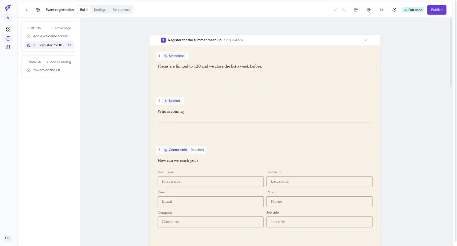
The Rail On The Left Is The Whole Form
Down the left of the builder are two cards. Screens is every page a respondent walks through, in the order they walk through them. Endings is where they land when they are finished.
A page holds however many questions you put on it. One question on its own is a page with one question; a page with six is six questions asked together. There is no separate container to learn — the rail is the form, and dragging a row moves the page.
Adding A Page
Three ways, and they all do the same thing.
Add a page at the top of the Screens card puts a new one at the end. The faint + that appears between two pages when you move the pointer over the gap puts one exactly there. And at the very bottom of the canvas, Add a page at the end does what it says.
Each row in the rail shows the page's title, or — if you have not given it one — how many questions are on it. Empty page is a page with nothing on it yet.
What A Page Can Say For Itself
Click a page and the panel on the right changes to that page's own settings. The heading tells you which one you are looking at, and directly underneath it says Applies at the next publish. That is not a warning; it is a fact about every field on this panel. Anything a respondent reads is part of the published snapshot, so it reaches them when you publish and not before.
Title is the heading at the top of the page. Leave it empty and the page has no heading; the rail then falls back to counting the questions.
Description is the prose underneath it. It takes three marks — bold, italic and a link — and nothing else, which is the same small set every piece of prose in a form takes.
Cover image puts a picture on the page. Choosing one gives you a Layout with four choices:
- Stack puts the image above the words.
- Split puts it beside them, filling its half of the screen.
- Float puts it beside them as a picture with room around it.
- Wallpaper puts it behind everything.
Split and Float then offer a Position — Start or End — which is which side of the words the image sits on. Start and End rather than left and right, because a form can be written in a language that reads right to left, and in Arabic the side a reader starts on is the right one. Stack and Wallpaper are not offered a position, because for them it would change nothing.
Wallpaper deserves a note. A photograph behind text is the easiest way in any form builder to make a form nobody can read, and the usual answer is a brightness slider you are expected to operate yourself. FlyForms does it structurally instead: under Wallpaper the questions render on their own panel, so words never sit directly on a picture and legibility is not something you have to keep an eye on.
Images may be PNG, JPEG, WebP or GIF, up to 5 MB and up to 6000 pixels on a side.
Continue button is the wording on the button that moves to the next page. Leave it empty and, as the panel says, Left empty, the form uses its own wording.
The Welcome Screen
A form may have one welcome screen, and only one. While there is none, a row reading Add a welcome screen sits at the top of the Screens card; once you have one the row is gone, because there is nothing left for it to add.
A welcome screen is a page that asks nothing. It has a Title, a Description and a cover image like any other page, and its button is called Start button rather than Continue.
Use one when somebody needs to know what they are about to be asked before they begin — how long it will take, what they will need to hand, who is asking.
Endings
An ending is a screen, not a setting, and that is worth a sentence. Because it is an ordinary screen, a form can have several of them, and different answers can send people to different ones. A quiz can end on a pass page or a fail page. An application can end on a thank-you or on a polite decline.
If you add none, the Endings card says The default thank-you page — a form always ends somewhere, and that is the somewhere.
Add an ending makes one of your own. It has:
Headline — the large words at the top. This is the ending's own text, not the page title, so it is the thing a respondent actually reads.
Description — the prose under the headline, with the same three marks.
When they finish — a pair of choices, Show a button or Redirect, and you may have one or the other. Show a button gives you Button text and Button link. Redirect gives you Send them to, and the browser goes there by itself. The two are offered as a pair rather than as two independent fields because a page that shows a call to action and then navigates away has thrown the call to action away. Switching from one to the other clears what you wrote in the other, so there is never a redirect hiding behind a button.
Cover image, with the same four layouts as any other screen.
Invite them to share — Share buttons under the message. Leave this off for a screen that turns somebody away. Turning it on reveals Suggested message, the words offered to somebody passing the form on. One honest caveat, and the panel prints it: X and WhatsApp use this. Facebook and LinkedIn ignore it and post the link on its own. That is those services' behaviour, not ours.
Celebrate on submit — A short burst of confetti. It respects a reduced-motion preference. Somebody who has told their computer they do not want animation will not get any.